
Utilizing the Cuyahoga Valley National Park and the Ohio & Erie Canalway Towpath, All Forward offers experiences that blend movement, reflection, and community in a way that resists easy description. Which is exactly the kind of challenge Studiothink likes.
Founded by Roseanne Deucher with a belief that small, impactful moments can have profound and lasting effects, All Forward had been quietly building something meaningful before its brand caught up. As the organization expanded its reach—serving corporate teams, community groups, and individuals—it needed an identity worthy of its impactful offerings. The founder came to Studiothink ready for a brand built to move and resonate with everyone from HR leaders planning an off-site event to individuals craving a thoughtful retreat.
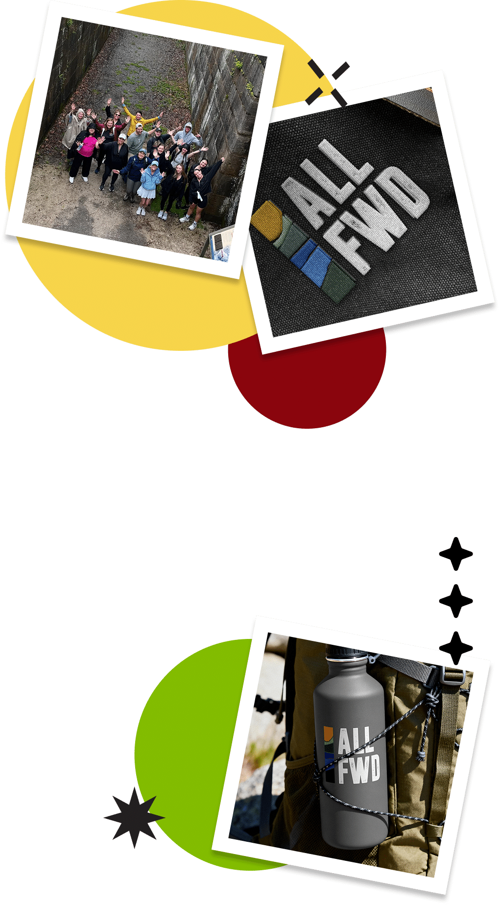



No two All Forward experiences are exactly the same. That's the whole idea. The team tailors each trip and its physical and immersive activities to the individual or organization. For Studiothink, the challenge was building a brand broad enough to encompass that variability without losing its thread.
Place mattered deeply—and it needed to show. The brand had to capture the particular character of the setting: the scale of the park, the texture of the trails, the quiet power of a landscape. But the identity also needed to reflect All Forward's commitment to the community surrounding it. From local outfitters to regional food partners, All Forward is distinctly Northeast Ohio, built on environmental sustainability and a genuine belief that when individuals thrive, organizations and communities thrive too. The brand needed to feel that way.

Studiothink approached the brand as both a system and a story. Like the experience itself, the concept centered on movement through landscape: a journey with a clear direction, even when the terrain shifts. Simple, but not flat. Grounded, but not static.
That tension guided every decision: logo direction, visual language, how the brand would behave across different contexts. The goal was an identity that could show up consistently whether it landed on a corporate sell sheet, a sign, or a social post at golden hour on the Towpath.
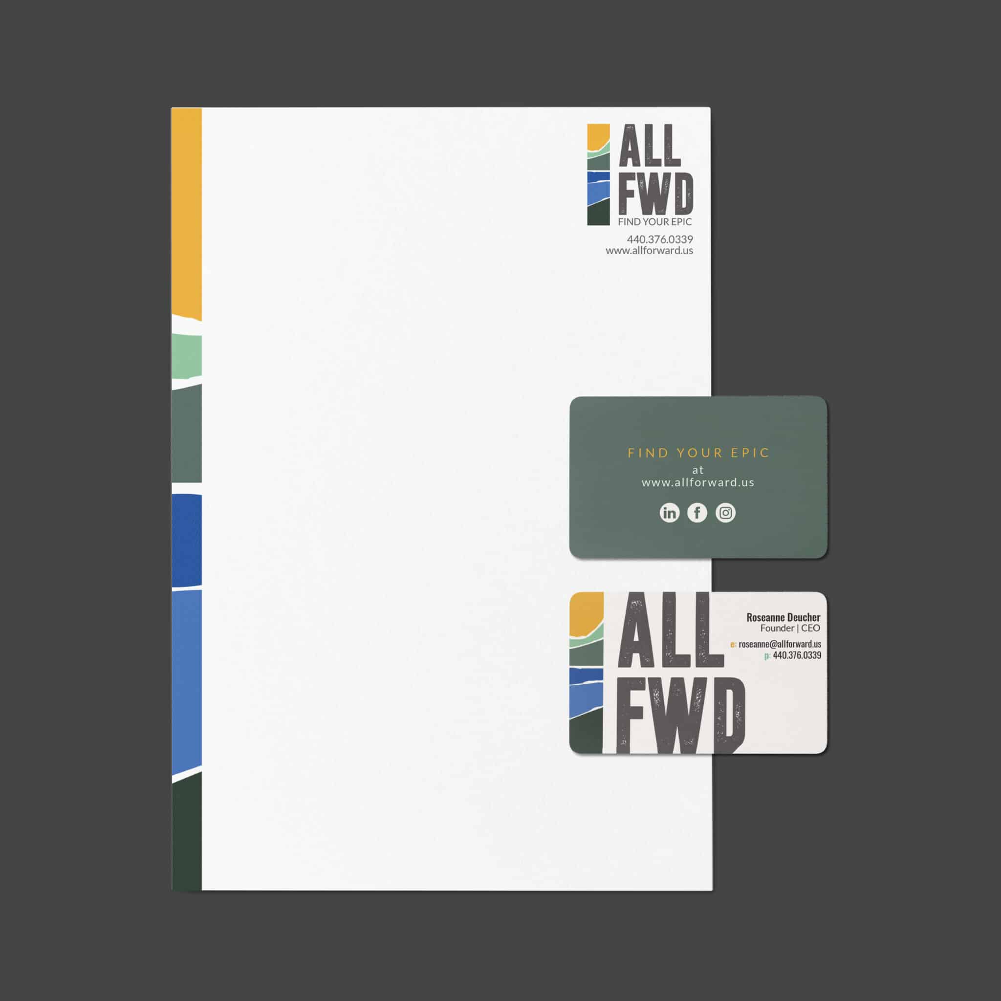
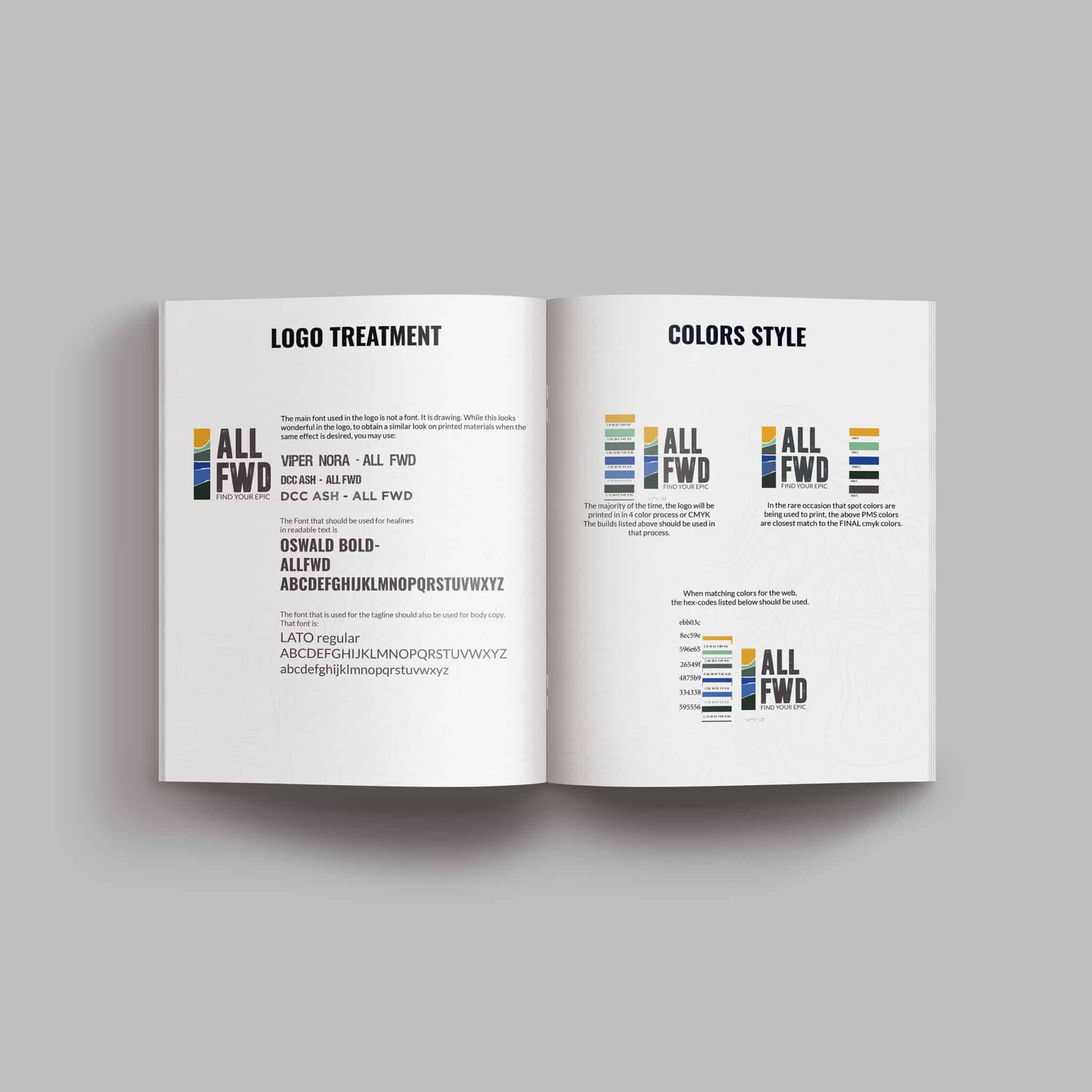

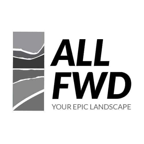
The logo captures a narrow slice of landscape—water, shore, land, and sky—layered into a single, clean icon. It's simple enough to work anywhere, and specific and memorable enough to stand for All Forward. The landscape column isn't decorative; it's the whole philosophy in visual form: layers of experience, all moving in one direction.
From there, Studiothink built out the full system: color, typography, brand guidelines, website, social graphics, and print materials tailored to different audiences. Everything is designed to feel like it belongs together—because it does.
